
Client
Manetain
Country
India
Year
2022
MANETAIN
BRANDING | PACKAGING | MARKETING
As curly-haired indian kids, some grown-ups must have surely tried to straighten their hair using a comb. Gosh! Growing up everyone has faced this. The founders, Hinshara and Yuba, also had a similar experience.
To rescue the day of curly-haired community, they set out on the path to develop a premium hair care range in India.
Manetain is all about love, for natural hair! As a curly-haired Indian kid, some grown-up must have surely tried combing your hair straight or tying it just to make your hair-tie break into pieces. To rescue this community, Manetain has set on a path to develop premium quality hair care products, made in India.
A brand that helps everyone embrace their natural hair and as the name suggests, maintain it!
BRIEF
REBRANDING
The rebranding project kicked off with a Brand Identity process that involved deep diving into the market research, which helped us understand what the community needs and where we stand with the opportunities.
At The Turtle Story, we start off with an interactive brand discovery workshop so that both us and the founders have better clarity about what manetain is and what it wants to achieve. Through an extensive competitor study and opportunity mapping, we craft a visual language that involves the brand’s unique persona in the market, the brand’s fresh vision, and its mission. This cultivates the brand’s values and it’s essence.


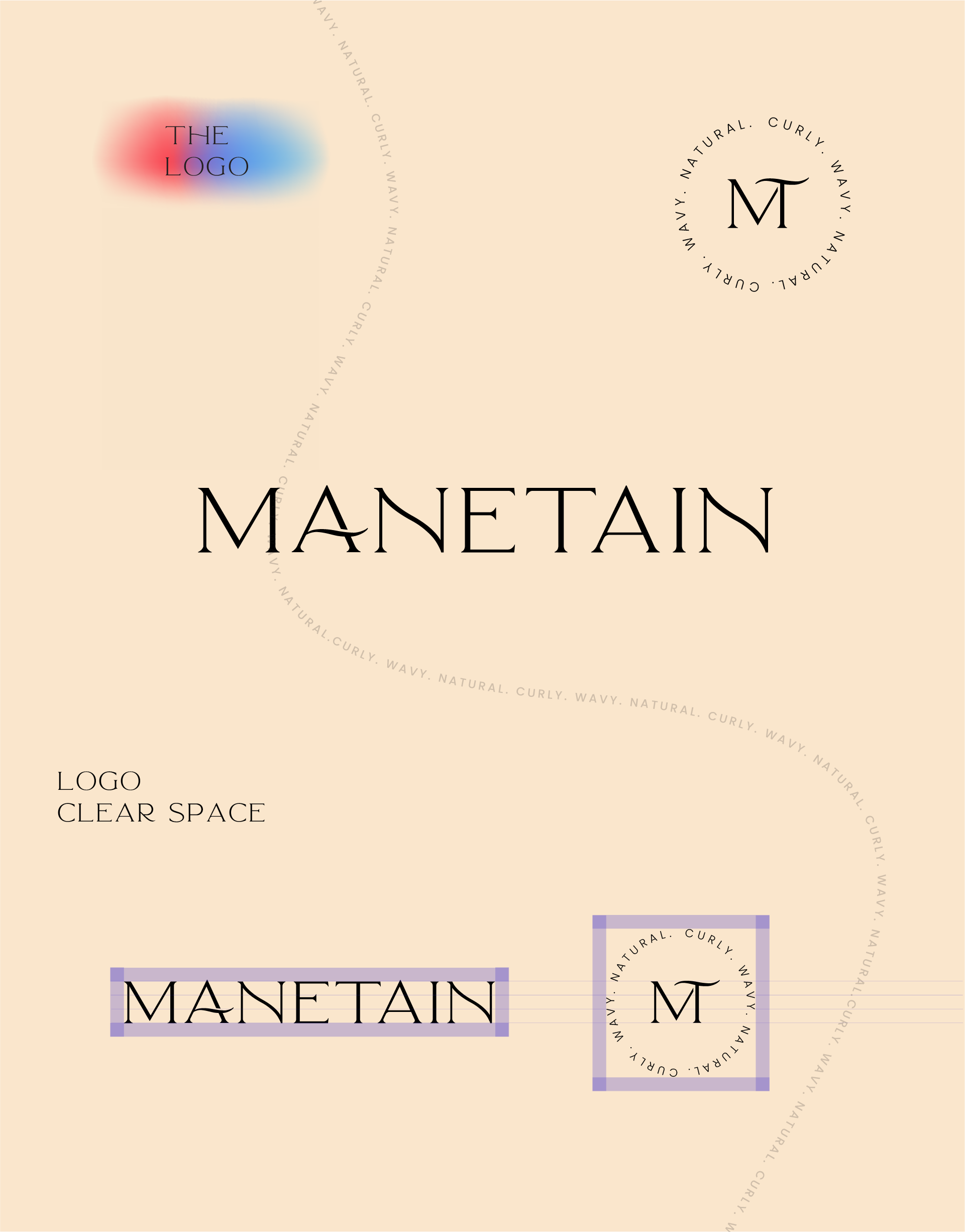
Manetain's rebranded logo reflects the brand’s vision of being a global brand. The modern and elegant typeface swirls with beautiful ligatures, that effectively express the contemporary and premium identity.
Take a closer look, the letter A depicts a wavy hair strand that effectively translates the brand’s essence of creating premium haircare products for natural hair.
Let’s make the world curly, wavy and natural
Ecstatic, Empowering, Empathetic
Identifying a color palette that communicated the brand’s tone of voice was a challenge for our team. We wanted to make sure that the brand is serious and trustworthy when it came to the problem of maintaining natural hair, yet it was a cheerful and modern brand.
So, we broke down the color palette into two sections - emotional and rational. The emotional identity is the brand’s peppy, bold, vibrant and cheerful personality, and the rational identity is the brand’s fresh, soothing, natural, and sustainable approach to the haircare solutions
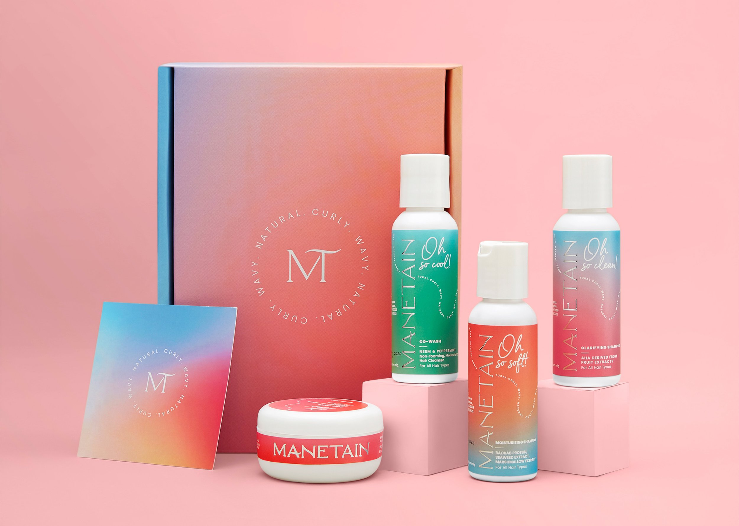
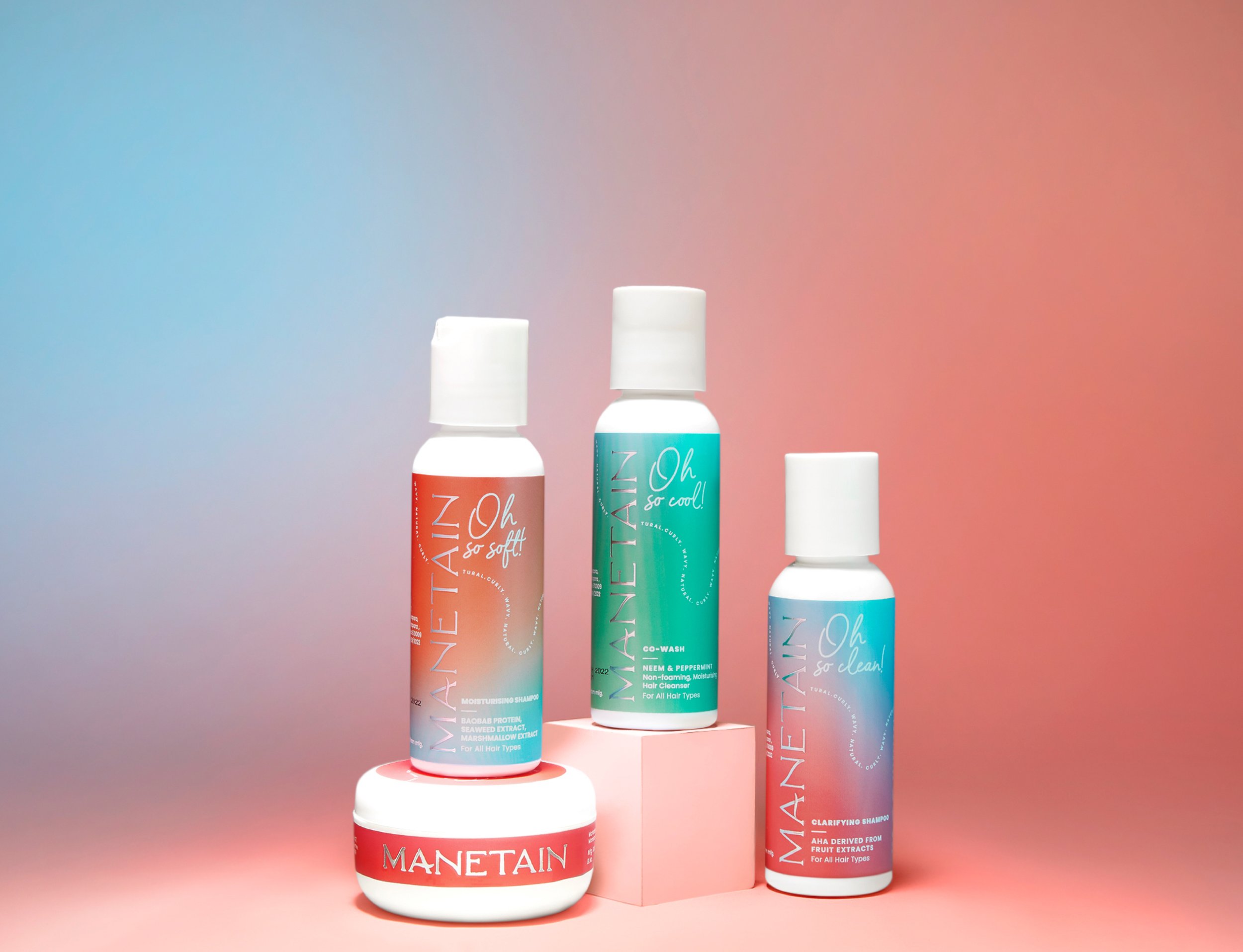
The reds and oranges represent the emotional identity of the brand and the blues and greens represent the rational identity of the brand.


After cracking down on the colour palette, our concern was to bring forward these colours with a zesty and eye-catching style.
We brought together the versatility of the consumers and the dynamism of product offerings with the style element – mesh and gradient.
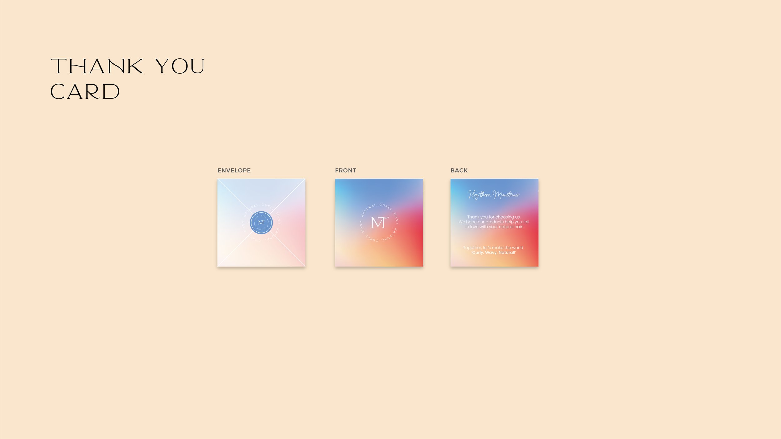
This adds a movement to the whole colour palette making it look charismatic. As gradients are incredibly dazzling, we gave each product its unique identity by combining some colours to bring out a unique label style. The wordmark on the label has a holographic effect, giving each product a futuristic and premium style.
Breaking the monotony in designing haircare labels, we created a unique yet uniform packaging style on the shelf.
Modern &
Premium Haircare

Going Digital
We designed preliminary pages of the Manetain store to establish the language of the website design and social media look & feel. We wanted to make sure that each aspect of this rebranding exercise had the brand’s fresh identity at its forefront - from the icons, down to the messaging and photography guidelines. Everything reflects the cheerful yet trustworthy nature of the brand.