
Rejuve
Rejuve is conceptualised from the word – rejuvenation. Rejuvenation means the act of restoring that youthful vigour. A brand that endures all the elements you need for rejuvenating your mind and body was crafted. Rejuve has an array of health supplements bottles which are potent and meaningful for your sleep, beauty, immune system, heart and body.
The wordmark resembles the shape of a butterfly. Here, butterfly symbolises resurrection, change, renewal, hope, endurance and the courage to embrace the change. This monogram communicates that with the power and wisdom of butterfly with you, a positive rejuvenation is just around the corner.
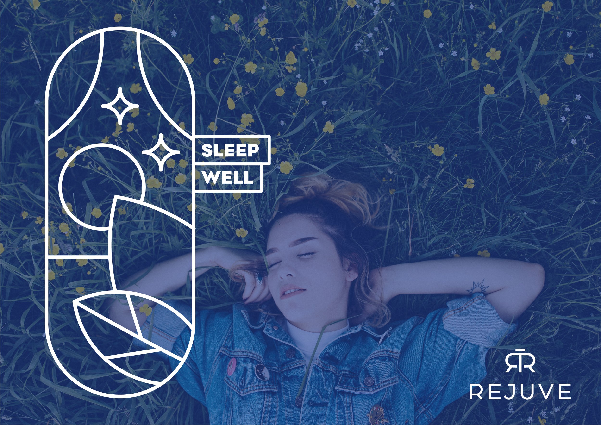
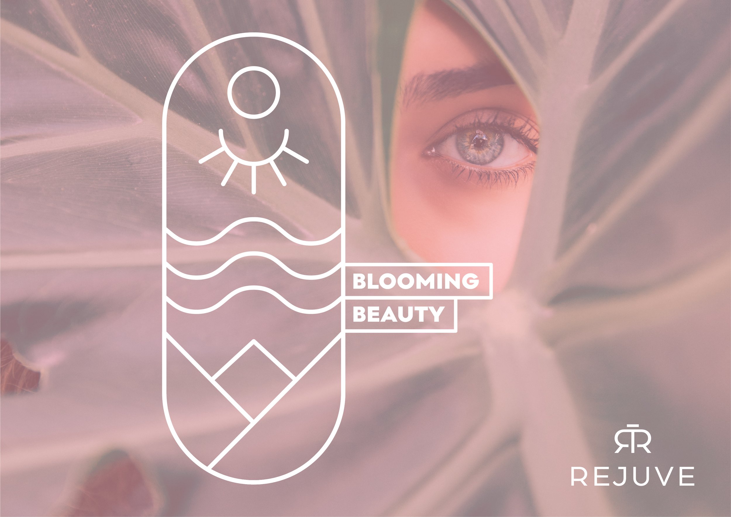
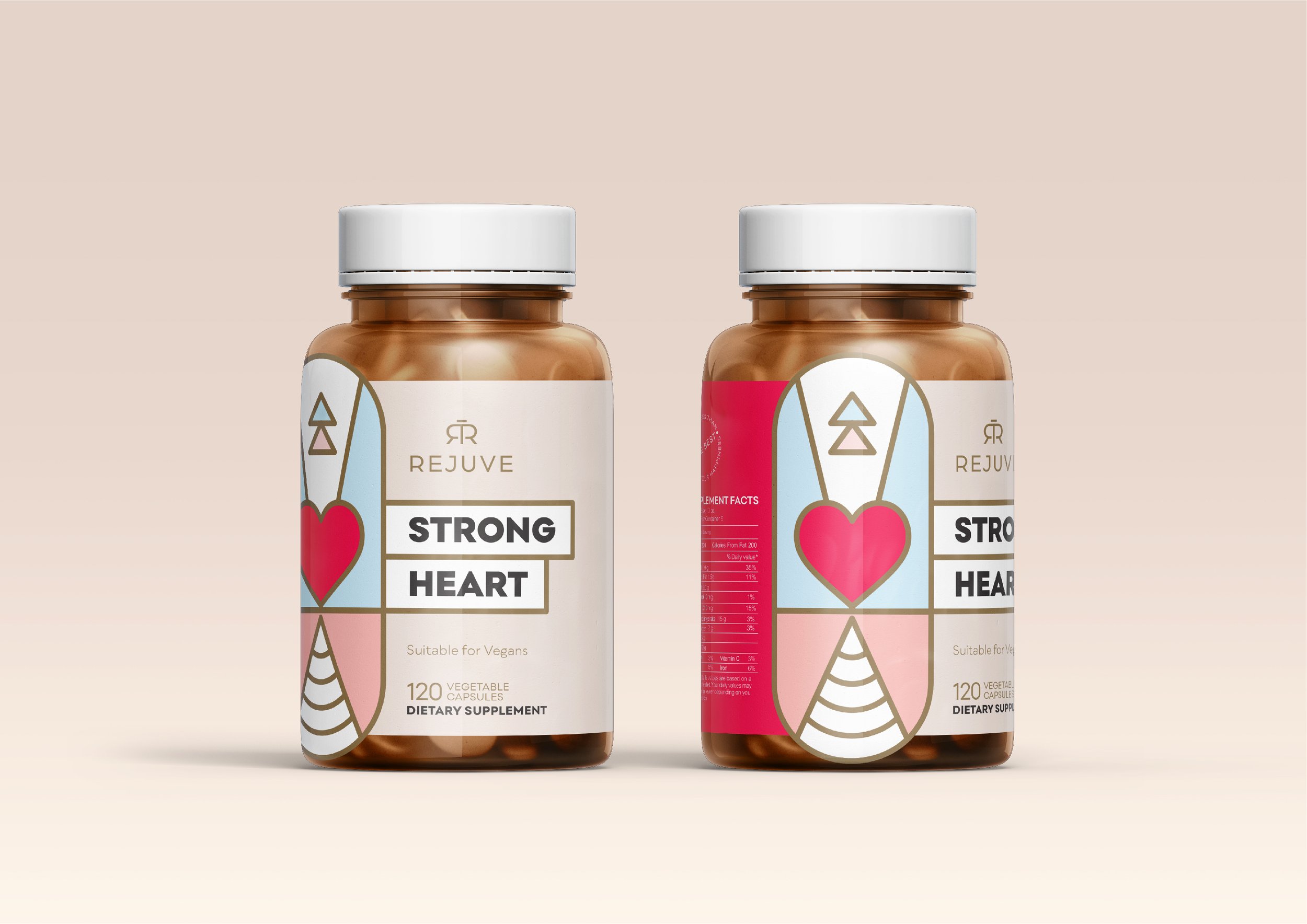
The soft colour palette and the pill-shaped illustration on the packaging design communicates the caring and thoughtful nature of the products, and achieves a high recall value. Take a closer look and you will see how each pill on this bottle cleverly communicates the purpose of the product, and how the colour palette instantly makes the product recognisable on any shelf. In a market of clinical packaging design, Rejuve was created to bring in the positive and thoughtful communication that the industry aims to achieve.