
Inspiring people to do things that inspire them.
- Client
- Pierag Consulting LLP
- Location
- Gurugram, India
- Scope
- Identity system, guidelines, collateral, launch & signage
- Studio
- The Turtle Story
Pierag is a consulting firm that helps businesses plan well and grow with confidence. Its identity had to promise what its advice delivers: precision, stability and upward momentum, built into one unmistakable mark.
01Out of the box thinking
It starts with a square: the box every good consultant is asked to think beyond.
02Upward arrow
Two planes lift out of the box along a 45° axis, forming an arrow that only climbs.
03Multidimensional growth
A third plane drops into place, giving the mark depth from every angle.
04The letter P
Read together, the planes resolve into a P. Sharp edges for precision; the square for stability.
Triangle as the dotThe i is dotted with a triangle that matches the symbol’s geometry and forms a second upward arrow.
Every edgehas a reason.
Nothing in the mark is decorative. Each element carries one of the qualities Pierag promises its clients.
A clean, contemporary wordmark set beside the symbol. Its triangular dot is the hinge between word and mark.
Navy
Blue
- Trust
- Loyalty
- Success
- Confidence
- Authority
Teal
- Concentration
- Growth
- Clarity
- Communication
- Intuition
- Empathy
- Creativity
Turquoise
- Uniqueness
- Objectivity
- Clarity
- Open-mindedness
- Wisdom
- Rejuvenation
A wider palette,paired with purpose.
Eight secondary colours work in fixed pairs, so each service line, from Financial Advisory to Startup Advisory, gets a voice of its own without leaving the system.
A · Cobalt + BeigeB · Jungle + Light VioletC · Violet + Pink RoseD · Palm + Peach
Four gradients.
#001467 → #00FFCD · midpoint 73
Thin · 100
Thin to black,one family.
- SherikaPrimaryHeadlines to captions. Thin through Black, with italics.
- MetrikSecondarySupporting text, data and long-form reading.
- ArapeyAccentAn italic serif that softens the geometry and adds a human voice.
Foster excellence todayto enrich the possibilitiesof tomorrow.
Hierarchy · Headline + tagline pairing
Written down,so it lasts.
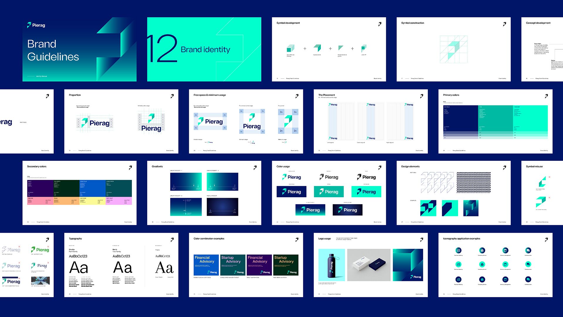
A complete identity manual covers construction, clear space, placement grids, colour, type, iconography, photography and every application, so the brand stays exact long after launch.
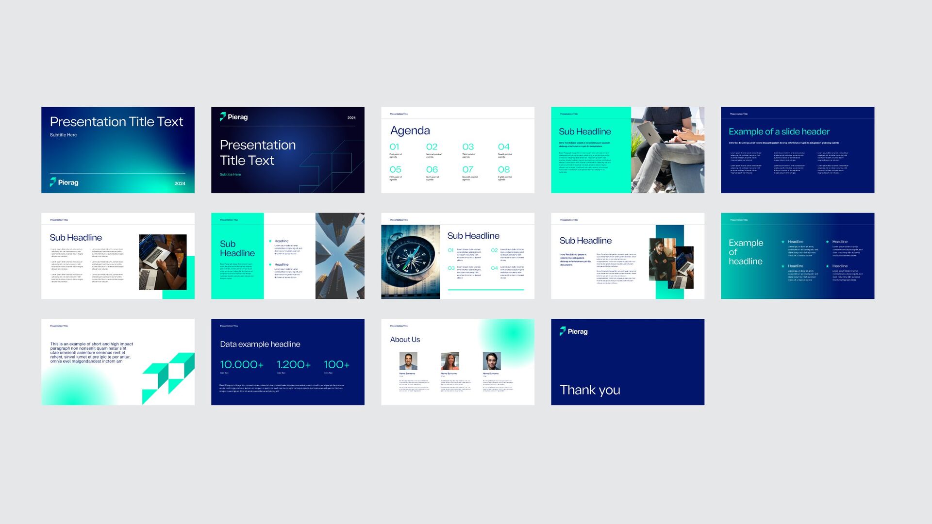
Every deck,on message.
A presentation system built on the gradients and symbol crops gives consultants ready-made layouts for agendas, data, teams and case studies.
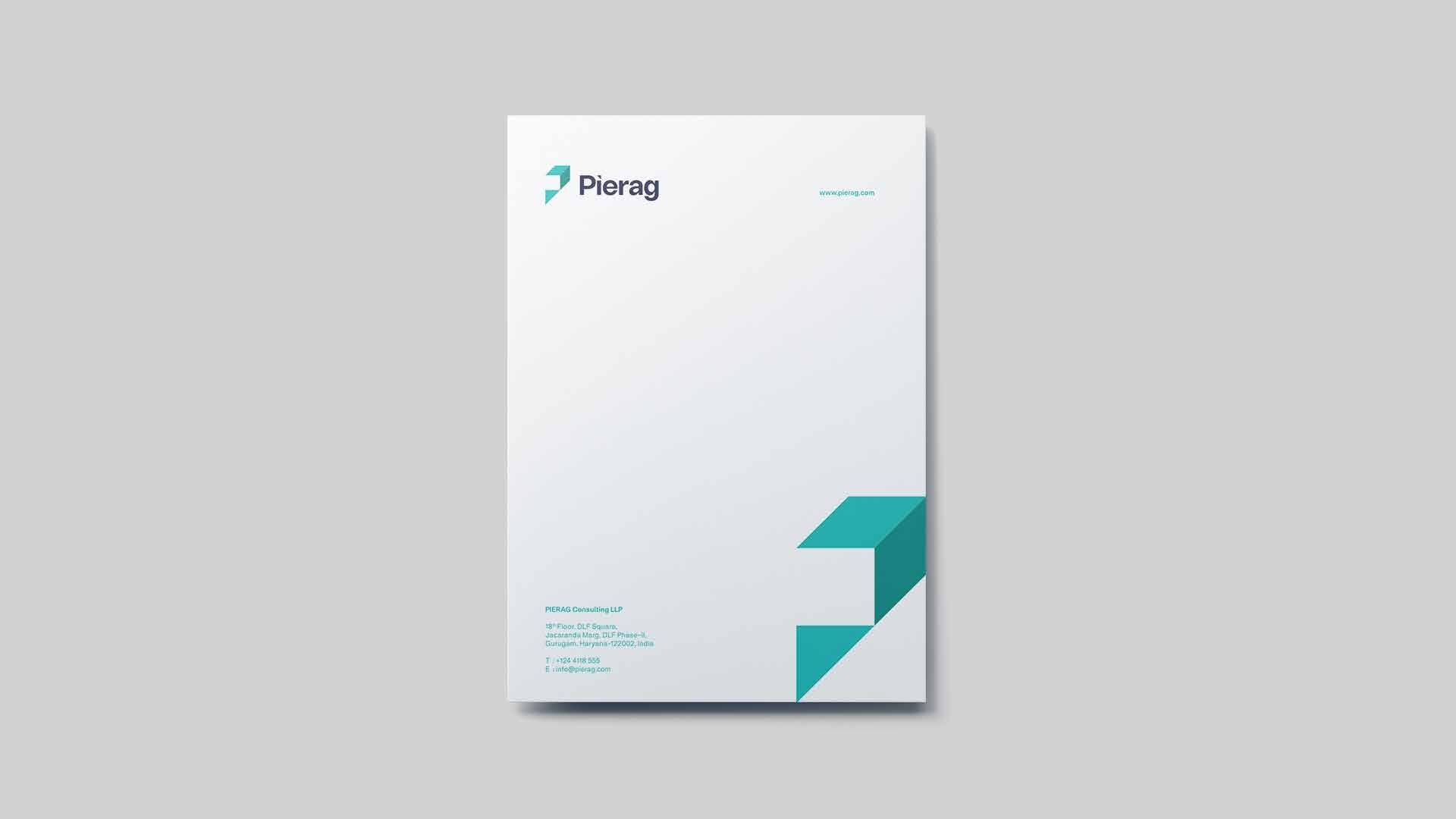
Quiet paper,sharp corners.
On paper the symbol is cropped into the corner, rising off the page, while the rest stays white and calm.
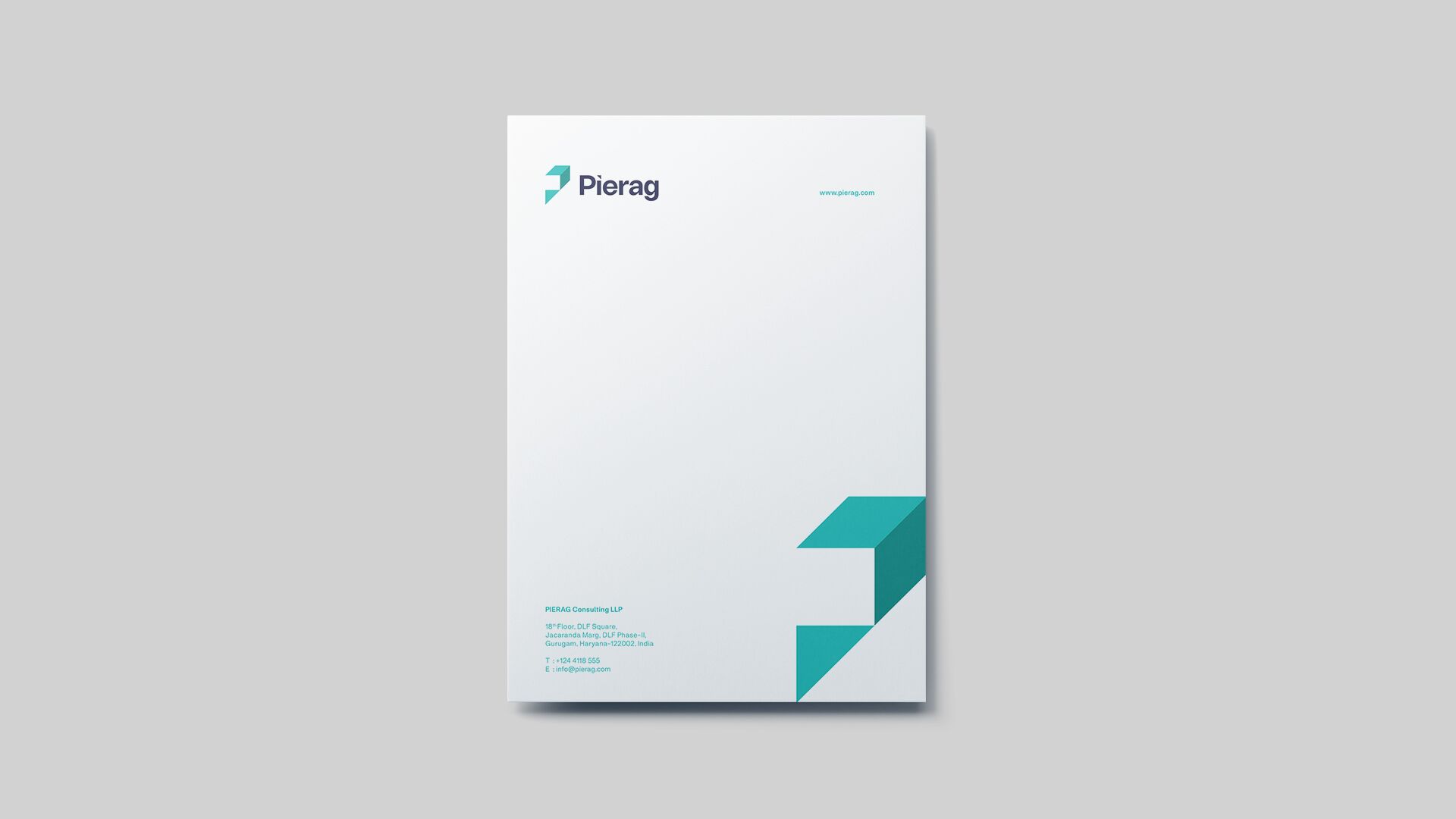
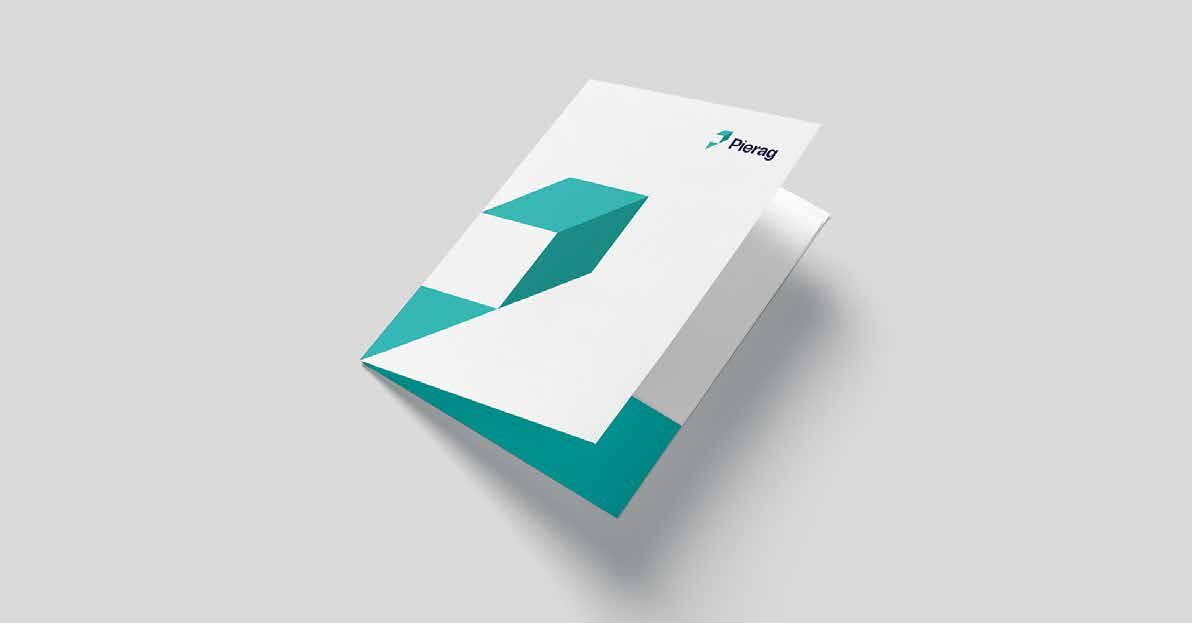
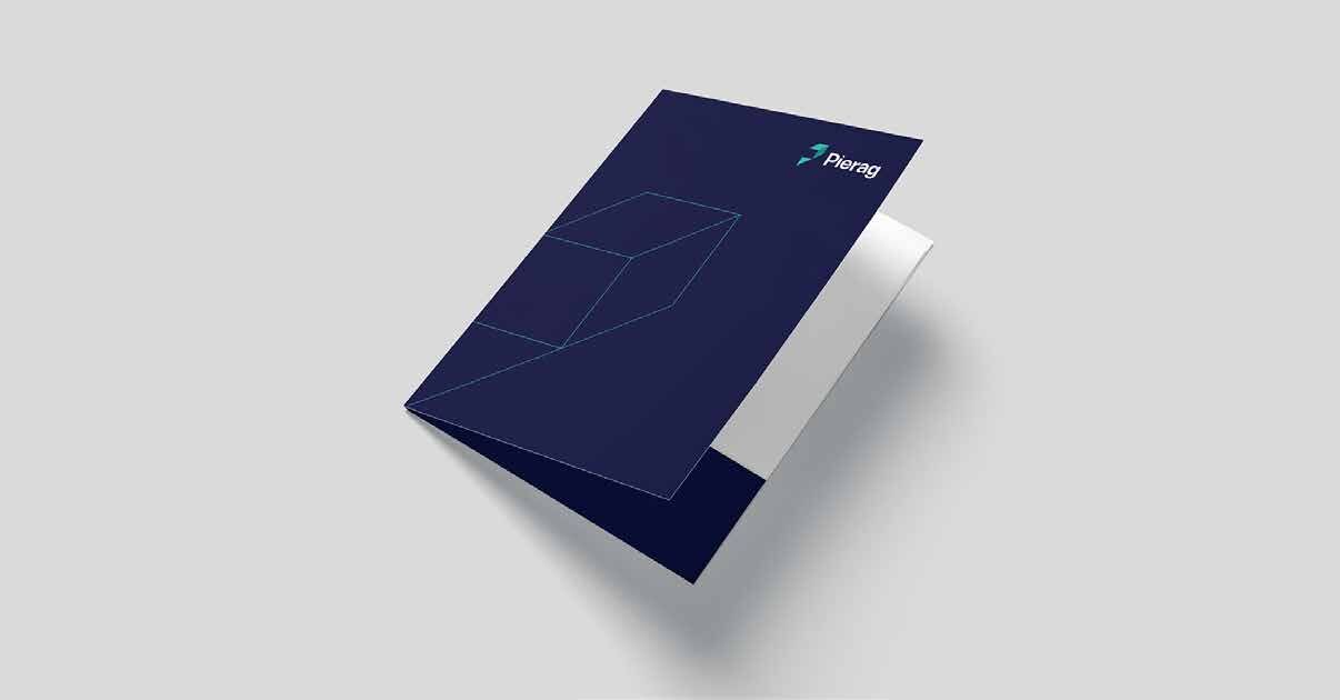
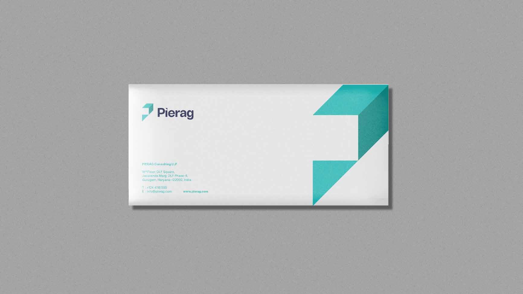
Letterhead · Folders · Envelope
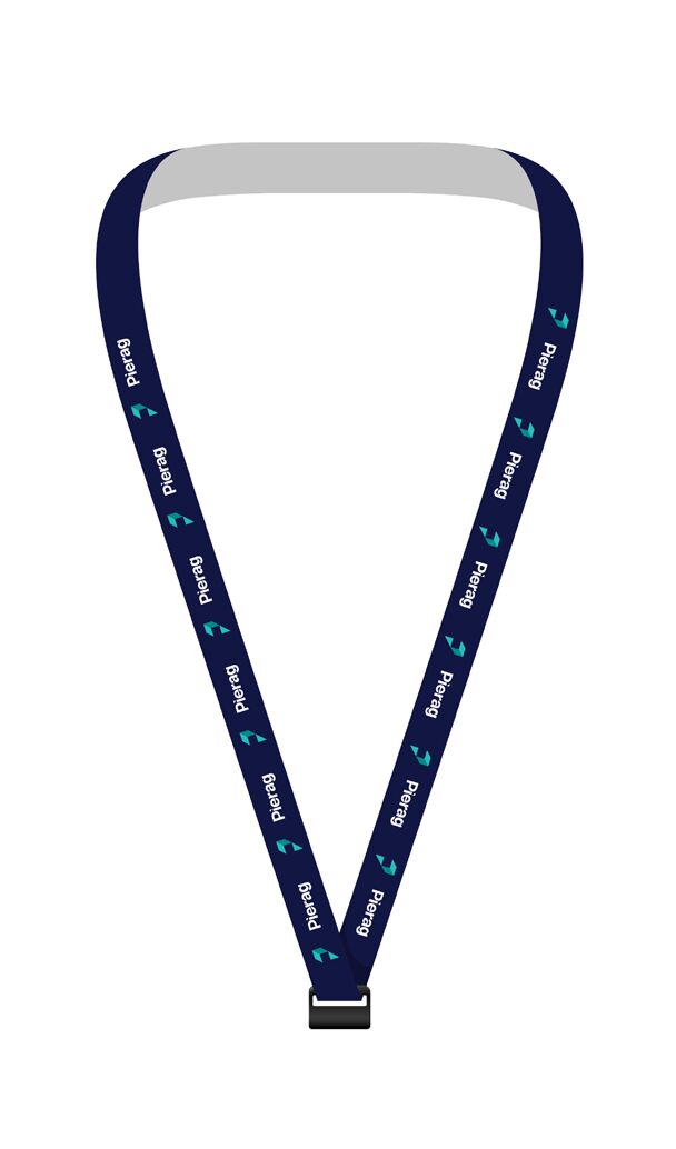
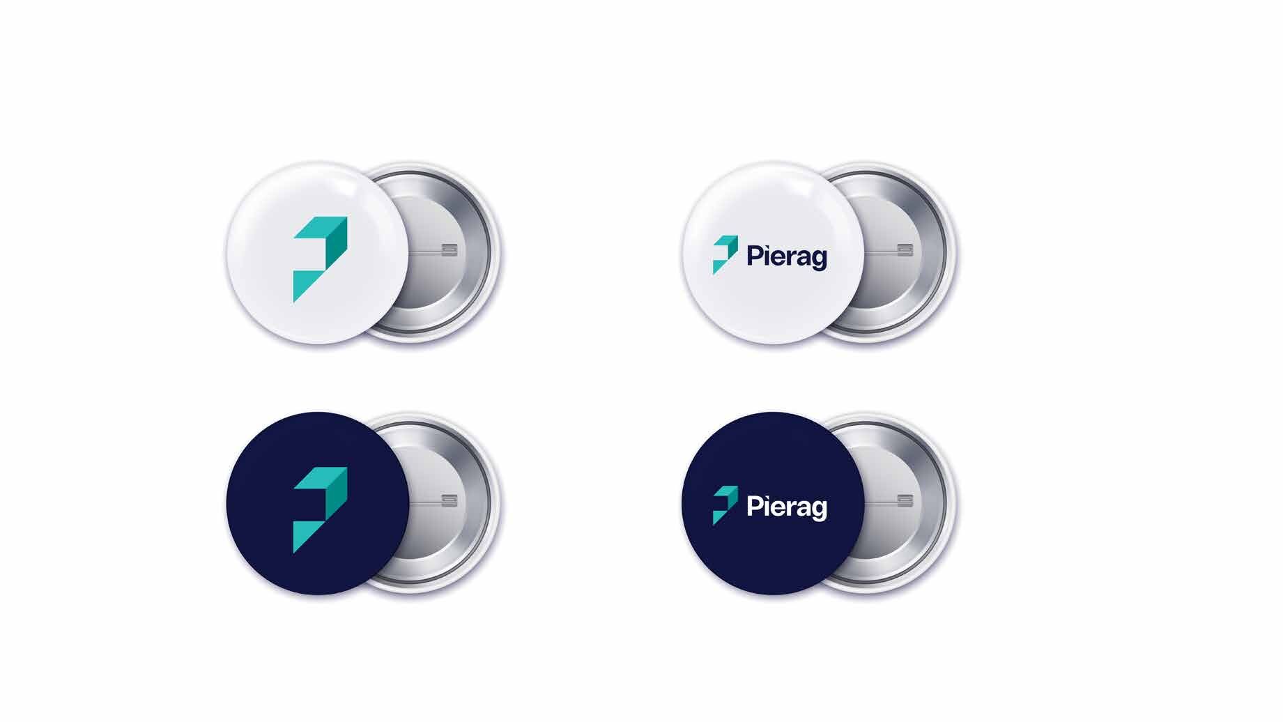
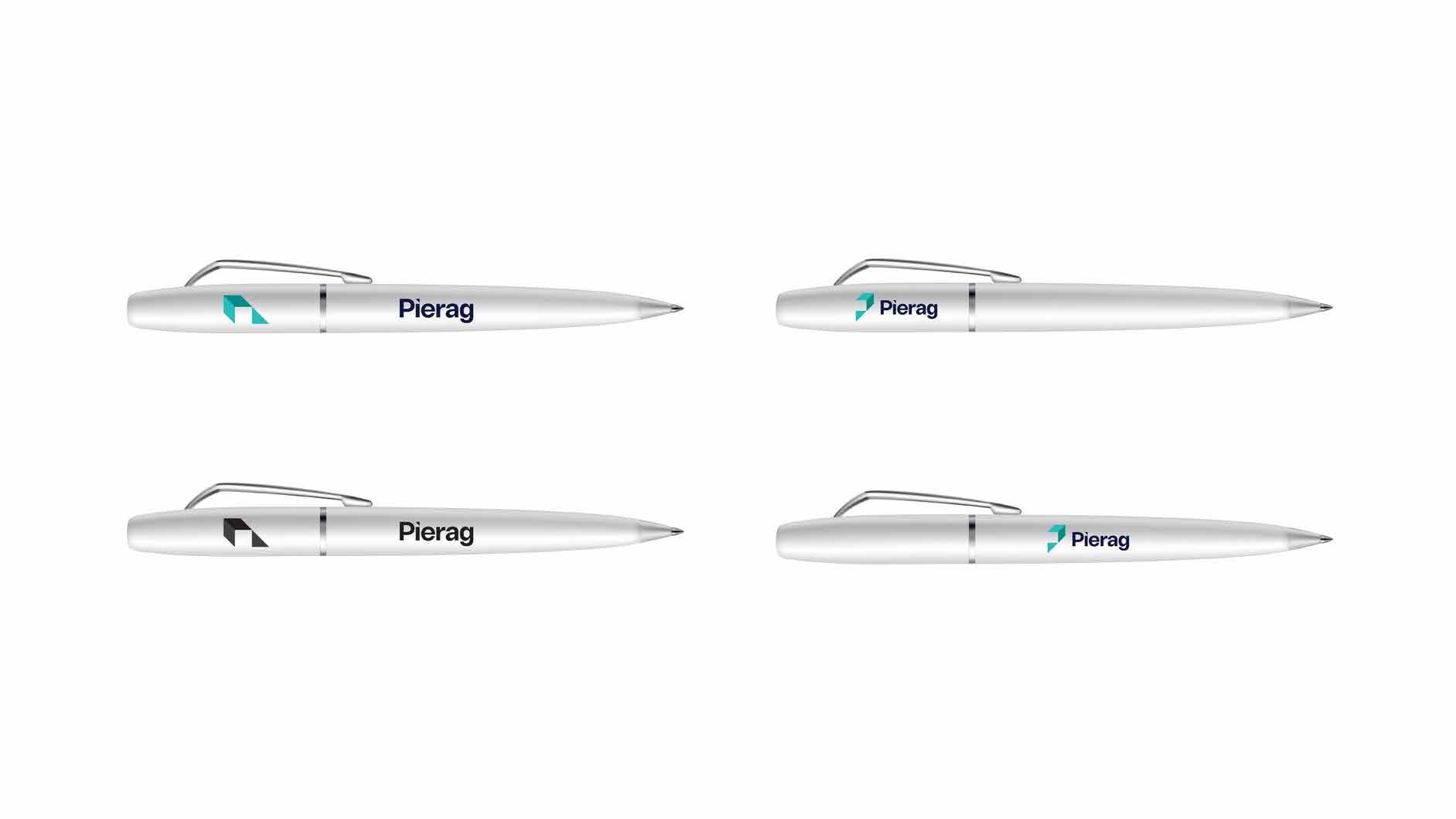
Worn, carried, kept.
01 / 09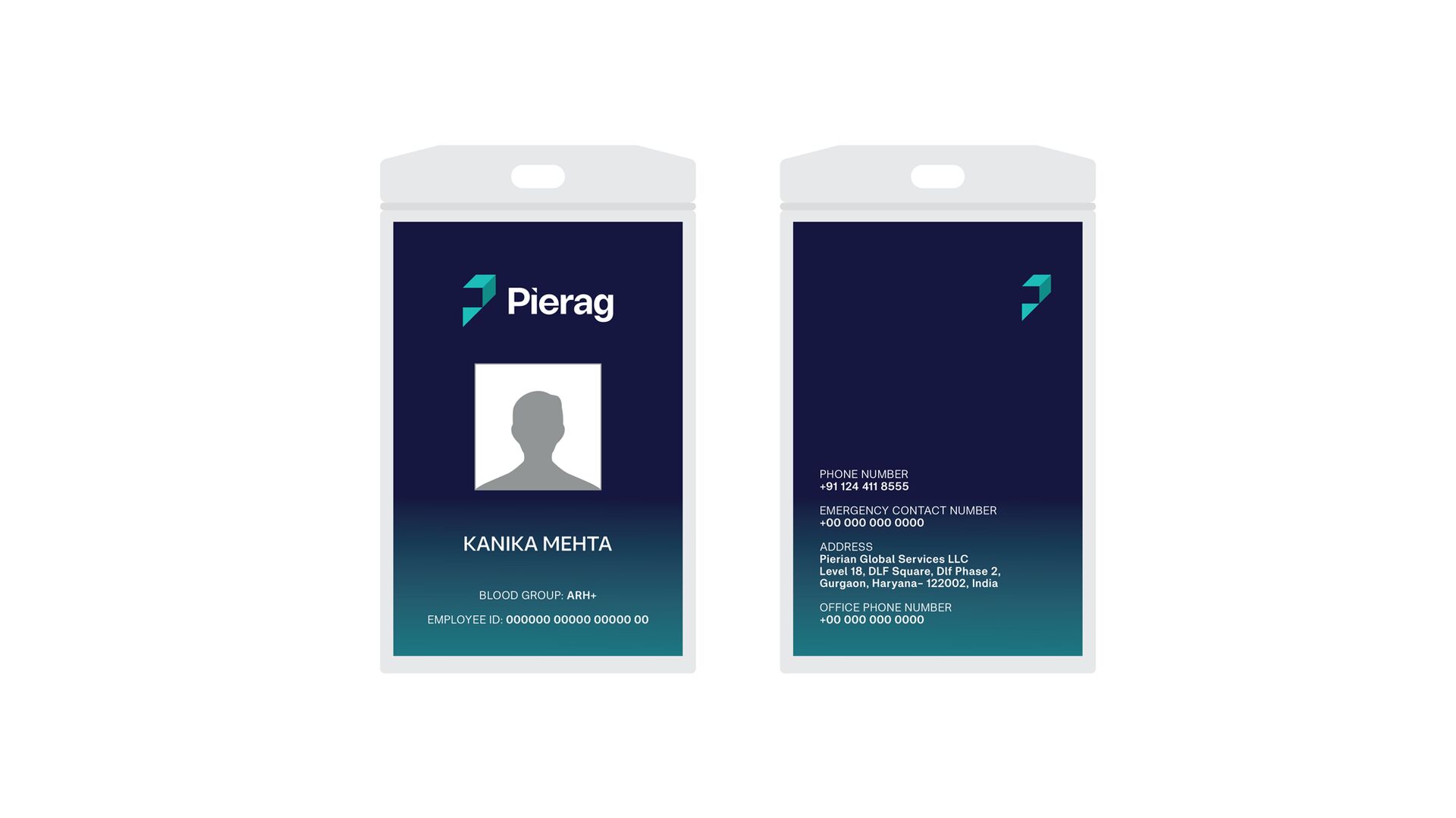
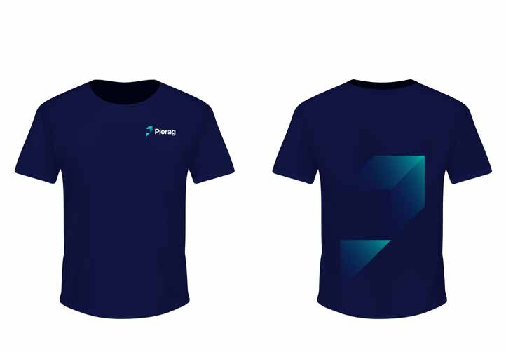
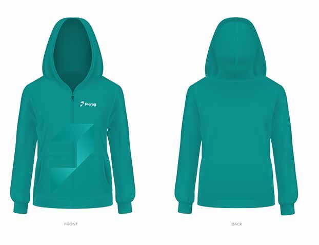
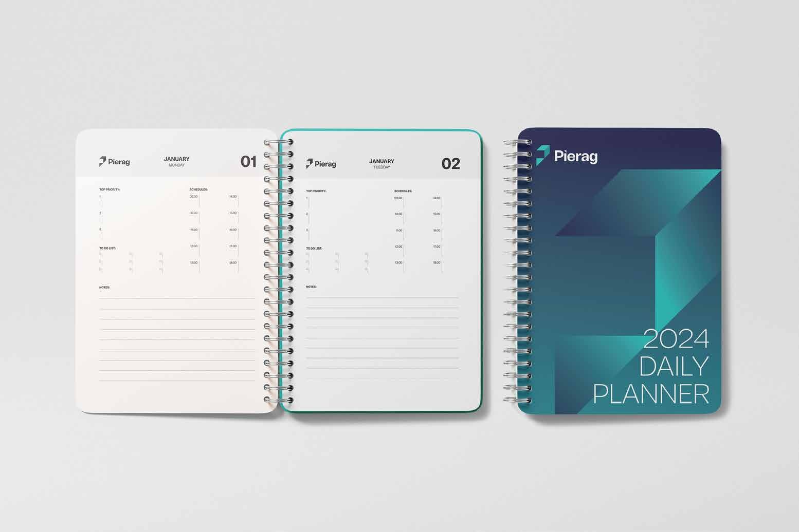
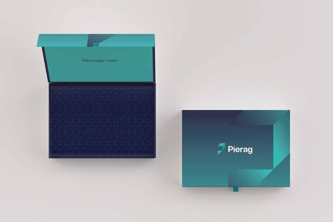
Watch
this space
A countdown, then a reveal.
Teaser posts built anticipation before the reveal. The same system carries through to launch posts and branded meeting backgrounds.
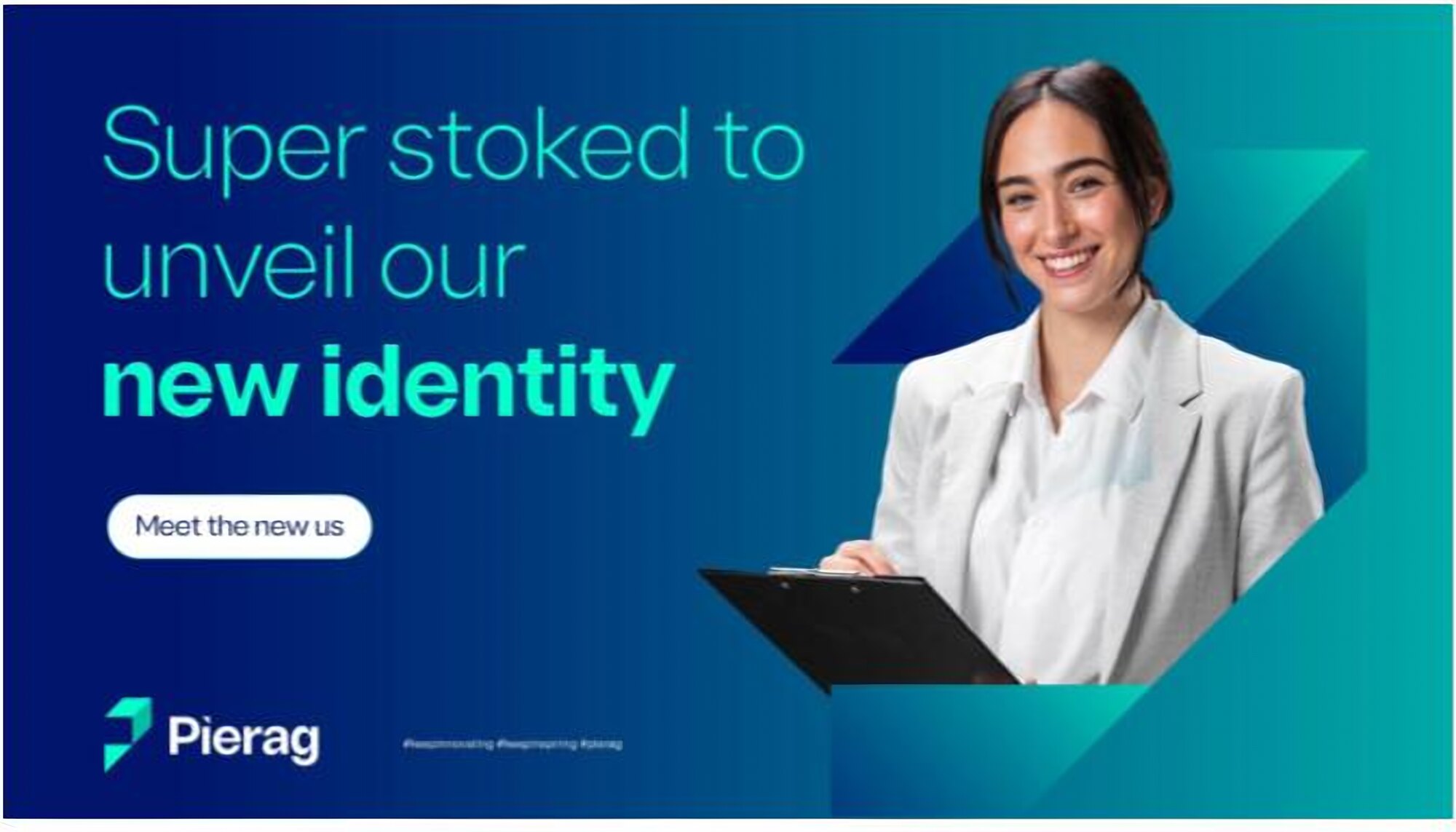
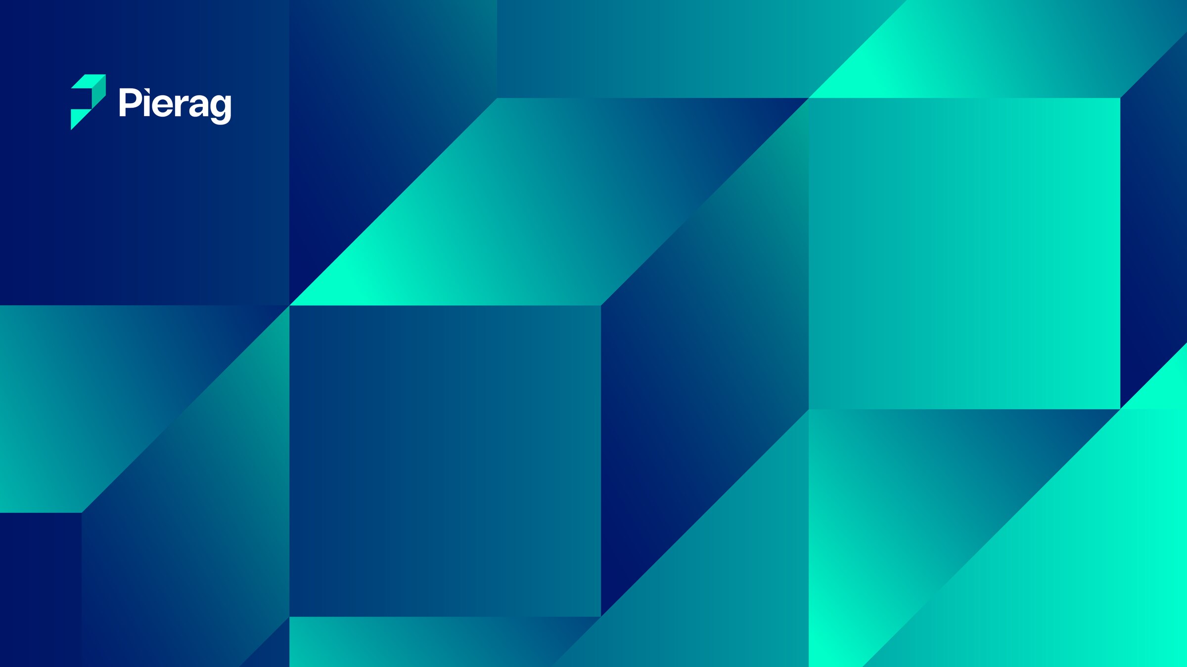
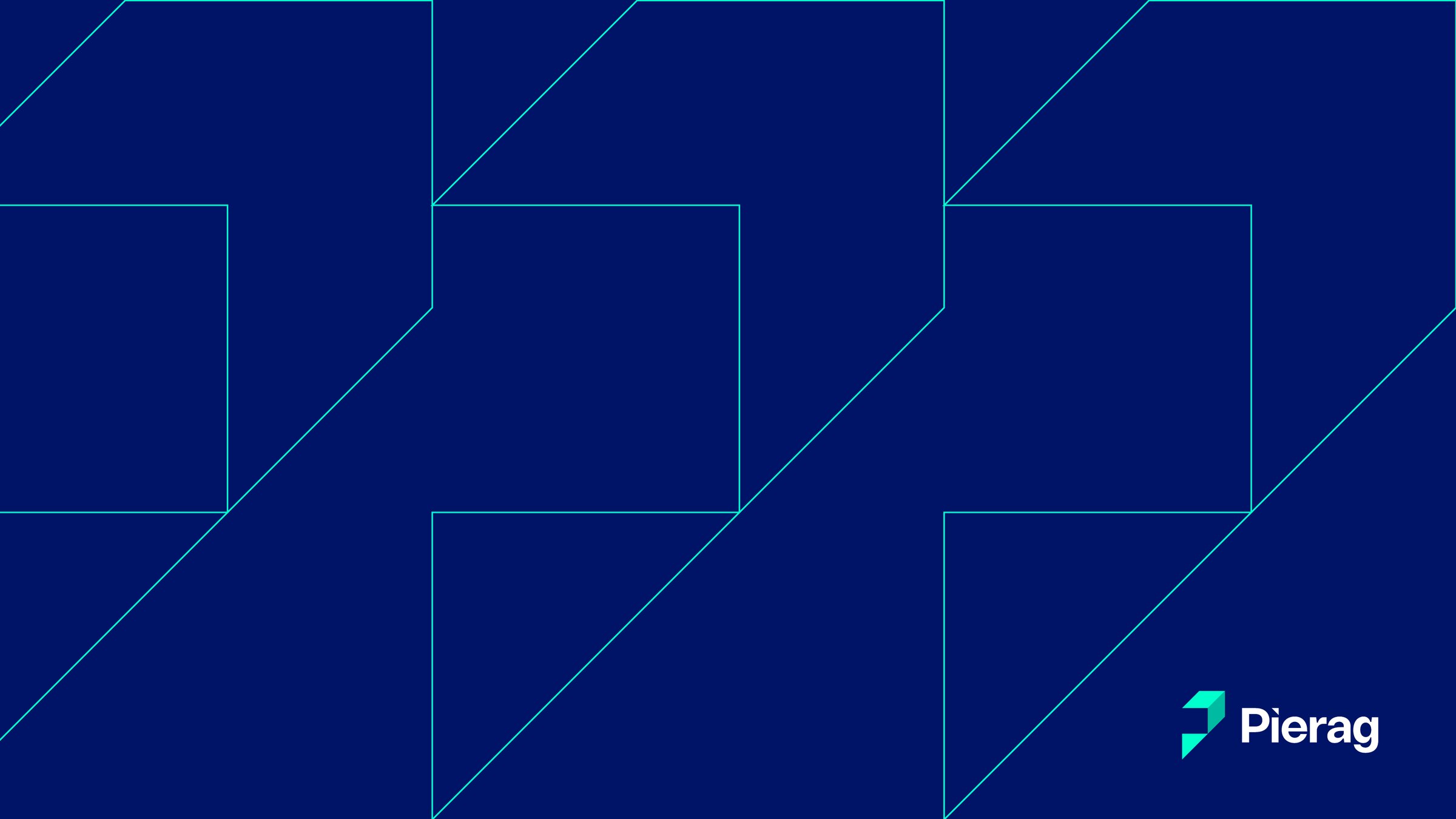
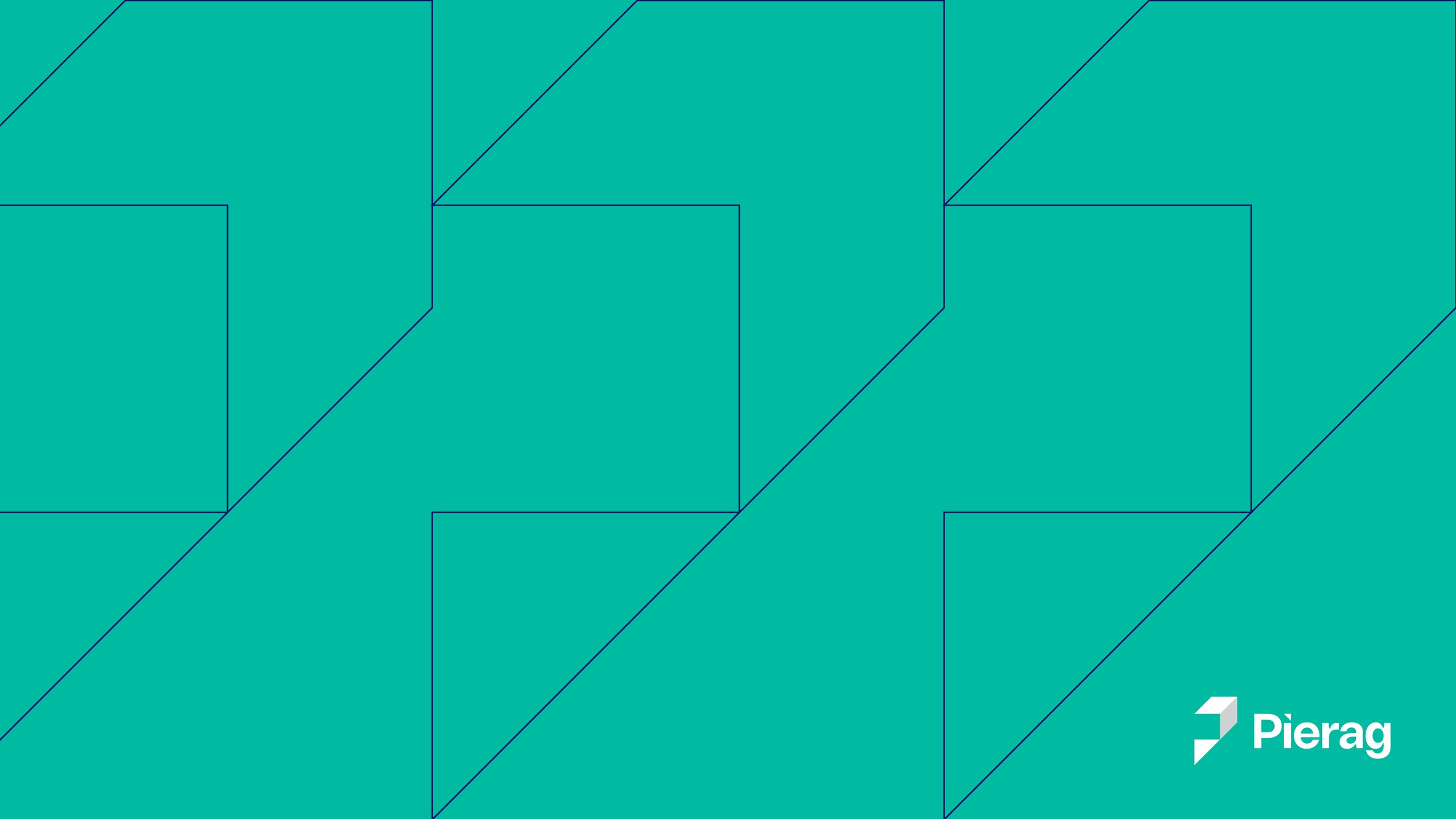
Meeting backgroundsEvery video call carries the identity, in gradient, navy and teal.
Climbingnew heights.
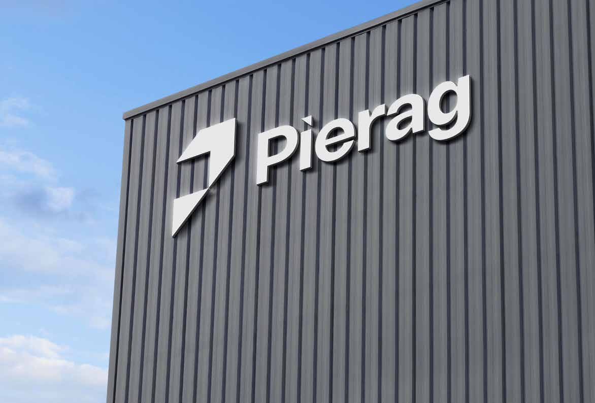
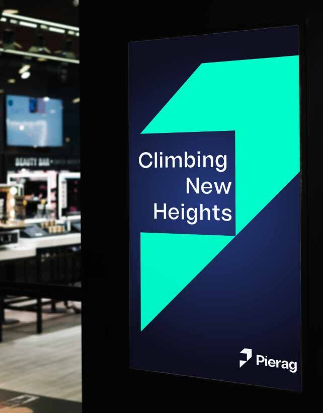
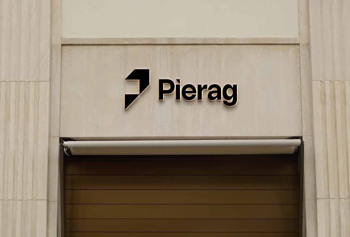
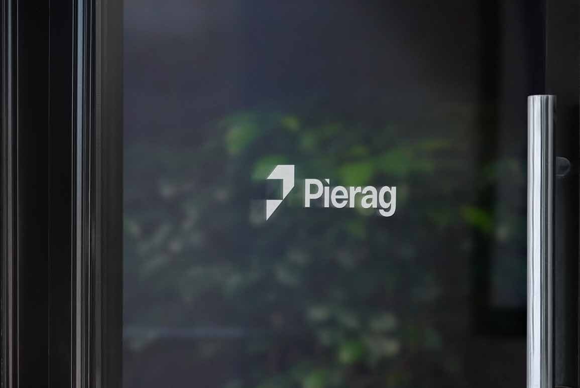
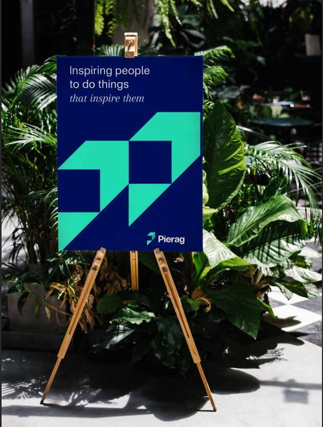
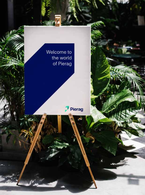
From the building facade to the glass door and event floor, the mark keeps its 45° climb at every scale.
Keep innovating, keep inspiring.
An identity as precise as the advice behind it, built to keep climbing.
Brand identityBrand guidelinesCollateralLaunch campaignSignage